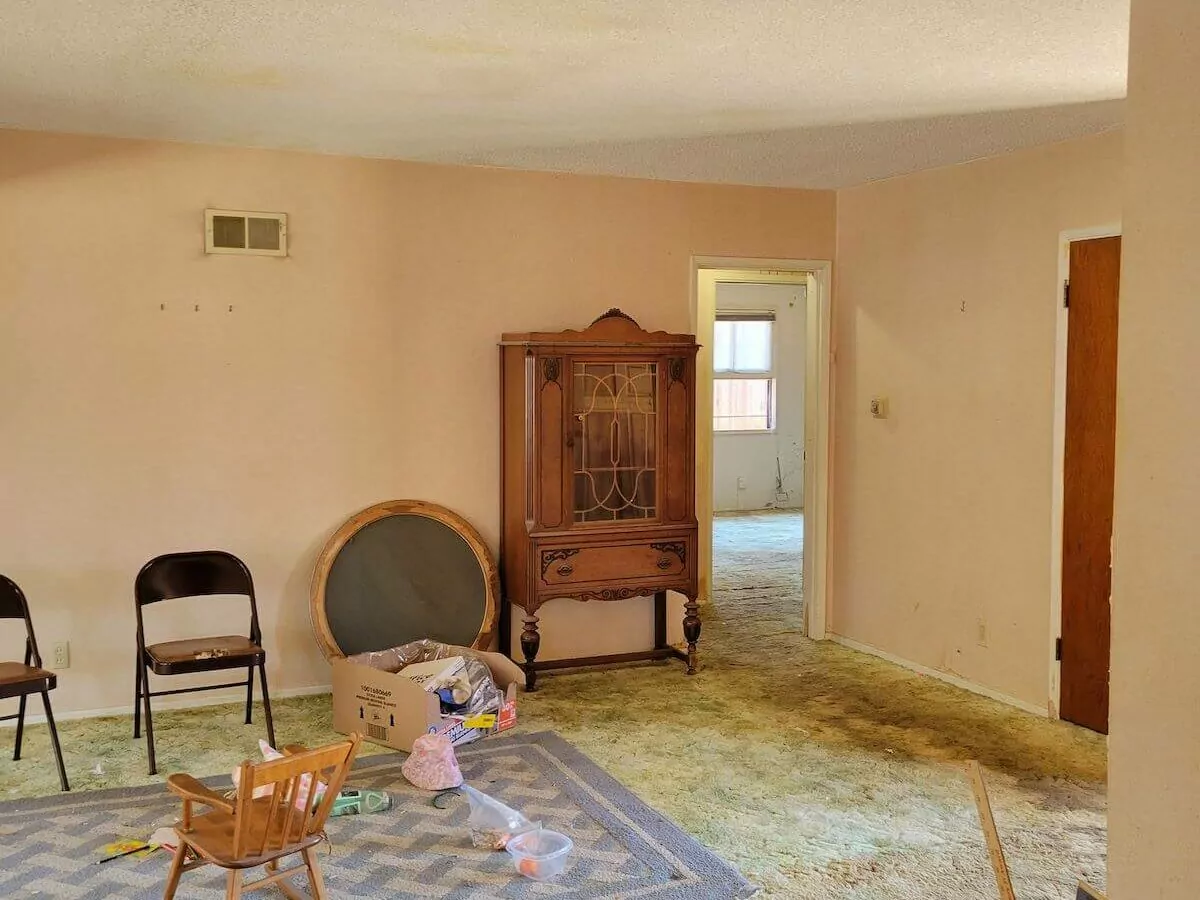
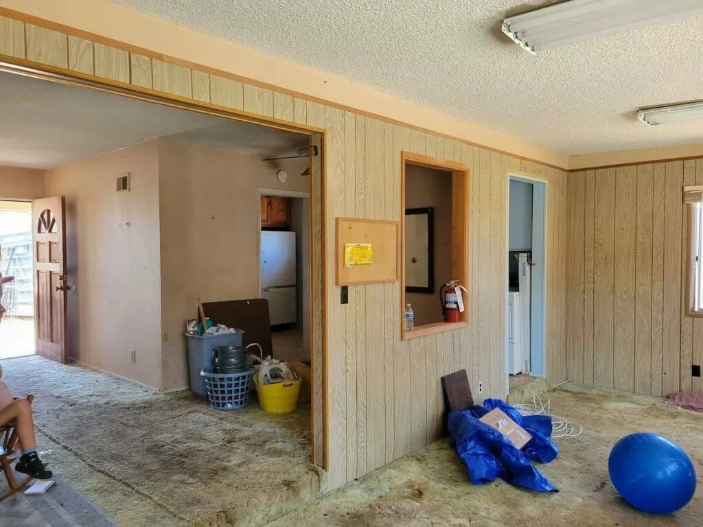
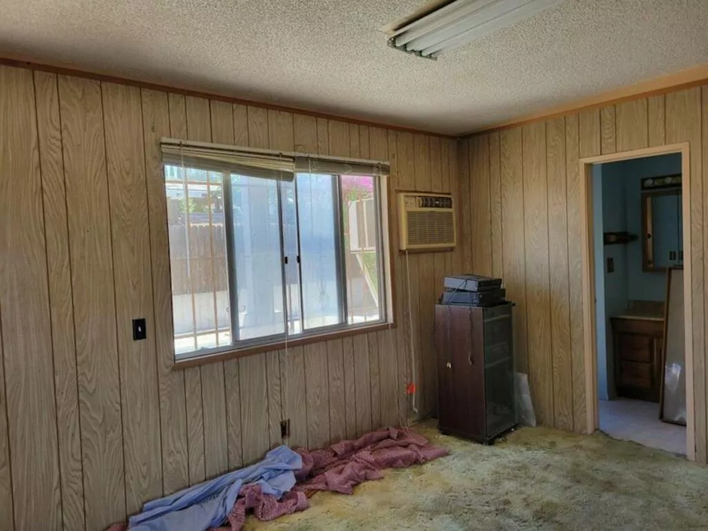
One more project carried out by the Groysman Construction team — house remodeling for a family residing in San Diego County. The family decided to modernize the outdated interiors and make the home contemporary, stylish, and functional. Groysman Construction, a remodel company headquartered in San Diego, has performed a full makeover: the most notable changes were done to the kitchen and bathroom.
Bathroom Remodel: Before and After
Despite being functional with the necessary storage space, the bathroom looked outdated with bulky wooden vanity units and wall cabinets. We aimed to make the space visually larger and let the bathroom appear airy, stylish, and comfortable. One of the main tasks was space optimization and installation of a walk-in frameless shower unit.
Before
Bathroom Remodeling: Changes
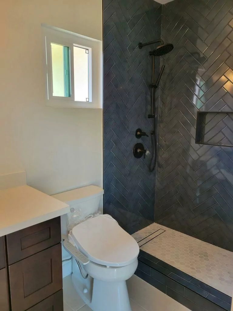
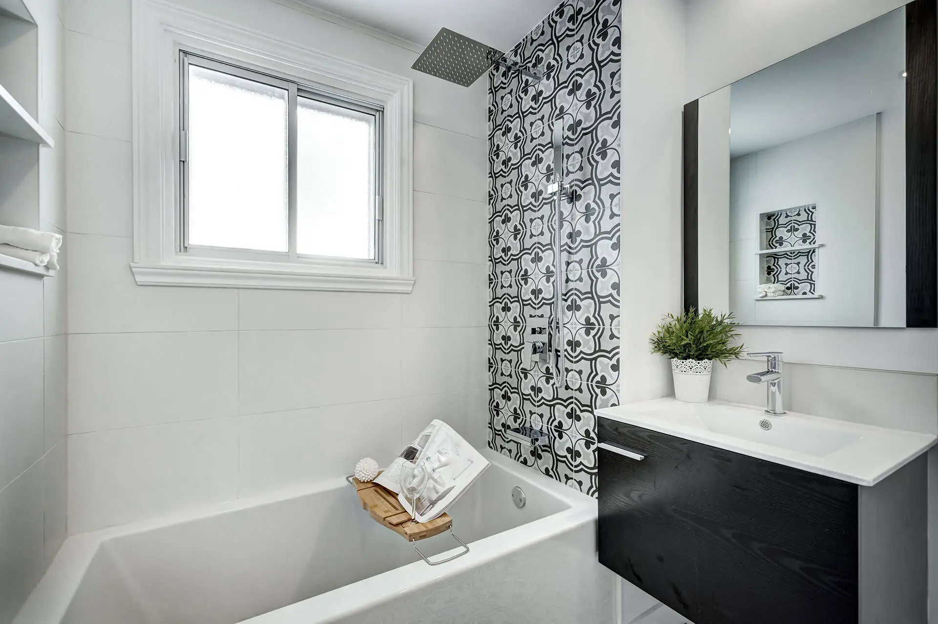
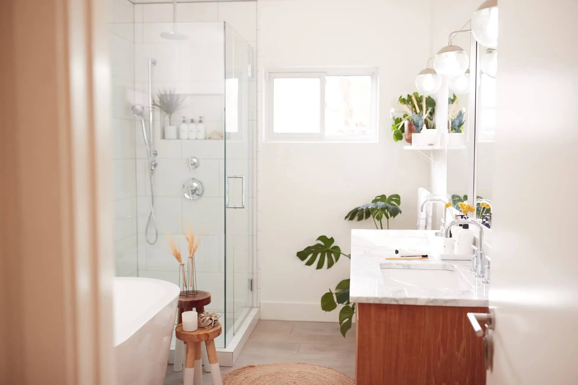
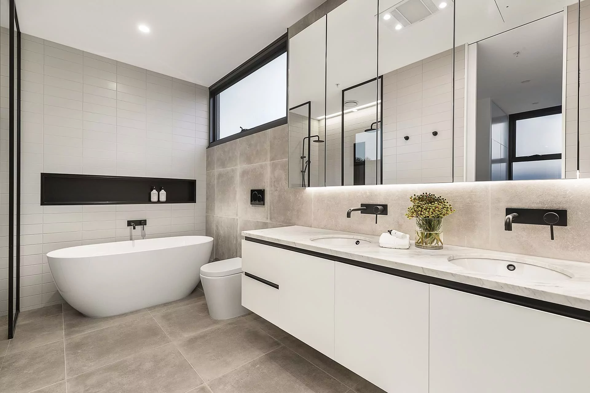
- We changed the color palette for the master bedroom to white with contrasting, chic black fixtures. White tile planks and the built-in wall niche expand the functionality and provide additional space for keeping shower and bath necessities at hand. Dark wood cabinets add aesthetics to the overall bathroom appearance.
- The additional bathroom features the same light color scheme with the dark-wood finish of a vanity unit and a walk-in frameless shower install.
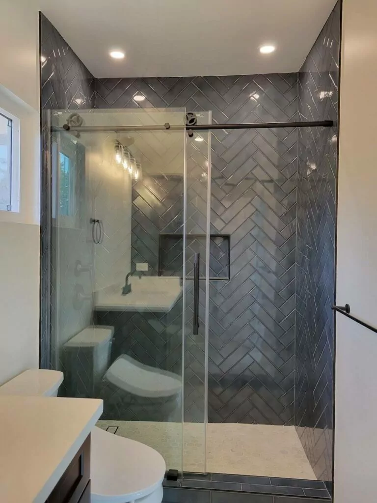
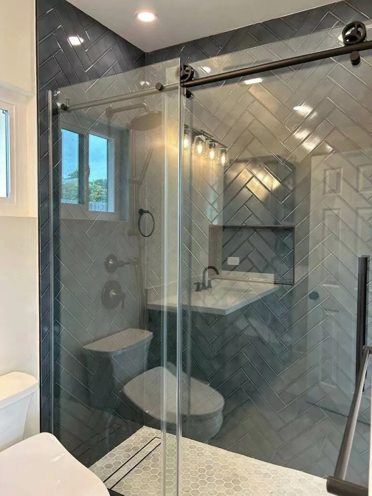
- The frameless shower install opens up the space, making the entire bathroom sleek and visually appealing. The shower door without a frame ensures good ventilation and plenty of light. Besides space optimization, the step-in shower design improves the functionality of the bathroom space and makes the showering experience more enjoyable.
- Built-in LED lights in the ceiling illuminate well the space; while additional lamps over the mirror add even more light and serve as spotlights and décor elements.
- Gray bathroom tiles in the shape of planks provide a textured surface that looks simply stunning. The built-in wall niche is handy to keep hygienic necessities close at hand.
- Overall, the space has been optimized and visually expanded; the new color palette, textured tiles, new lighting scheme, and black fixtures ensure a personable and trendy look.
Results
Upon completion, bathrooms look spacious and stylish. White walls and white sanitary equipment coupled with a new lighting scheme create an airy feel. Black contrasting fixtures add luxury and chic to the bathroom’s appearance.
Kitchen Remodel: Before and After
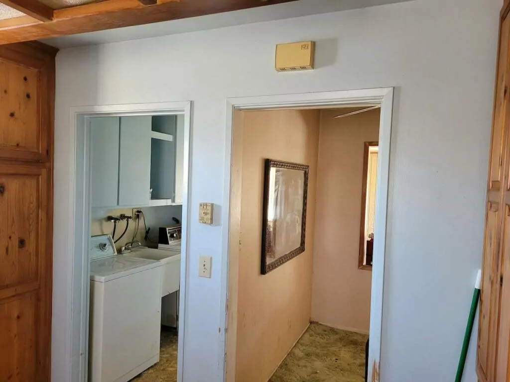
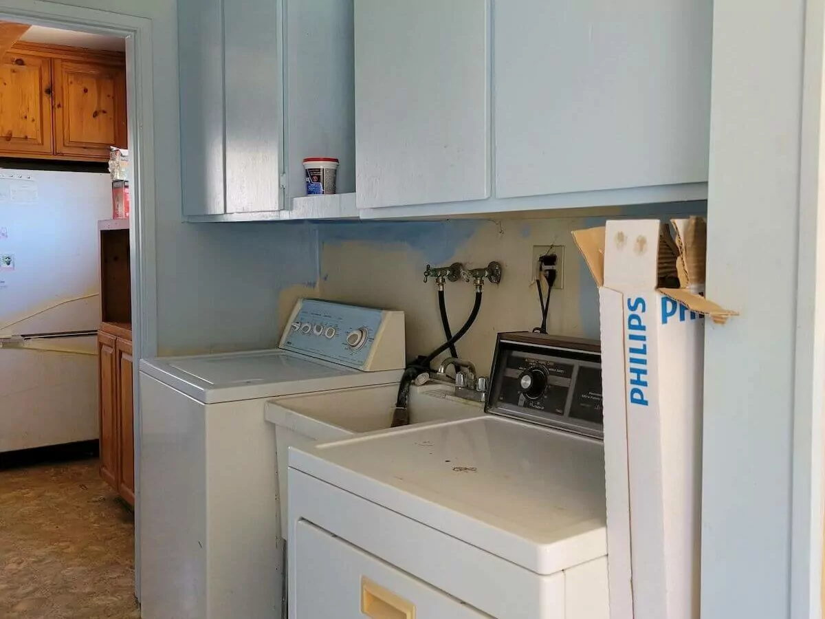
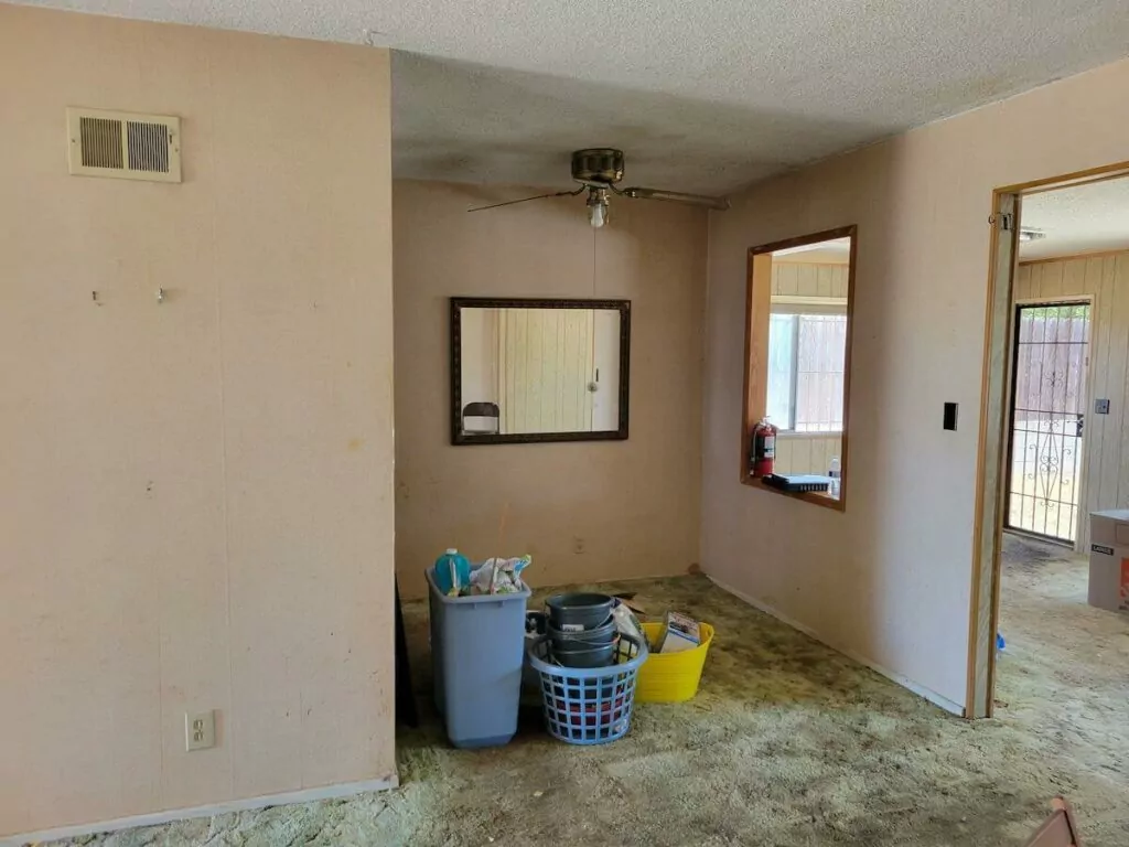
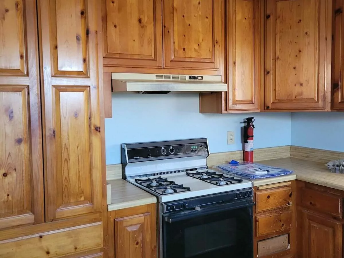
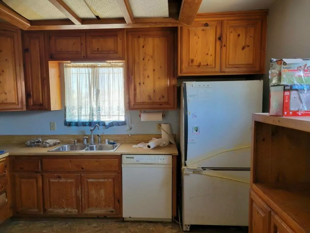
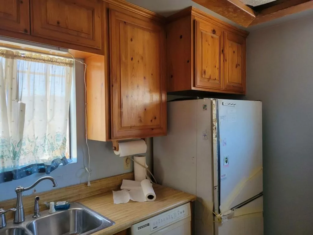
The original kitchen with wooden cabinets and appliances fitted along the window wall looked cramped and tight. Despite being functional, the kitchen felt cluttered and outdated. The task was to expand the kitchen zone by sacrificing the adjusted laundry room to install a kitchen island with a built-in induction cooktop, stove, and hood. Clients intended to make the kitchen airy and spacious.
Before
Kitchen Remodeling: Changes
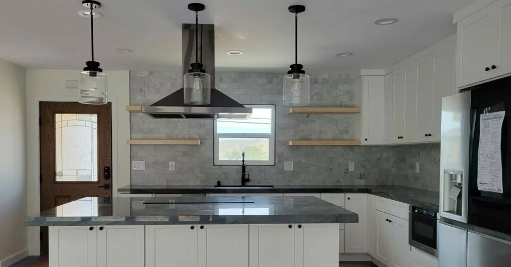
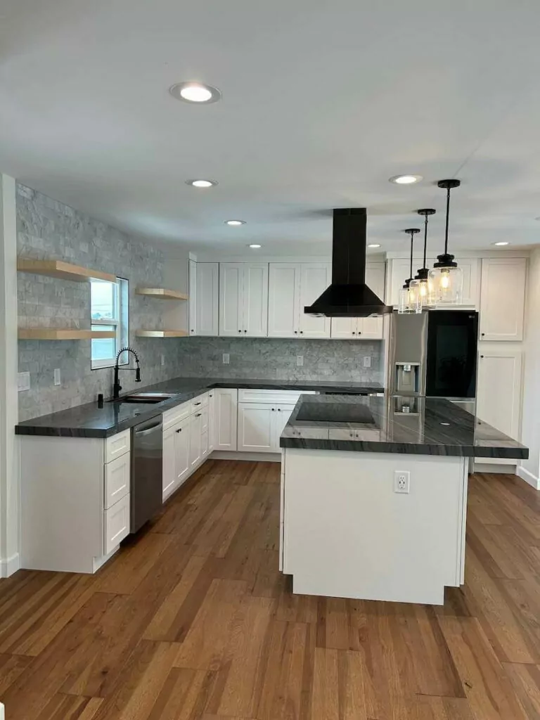
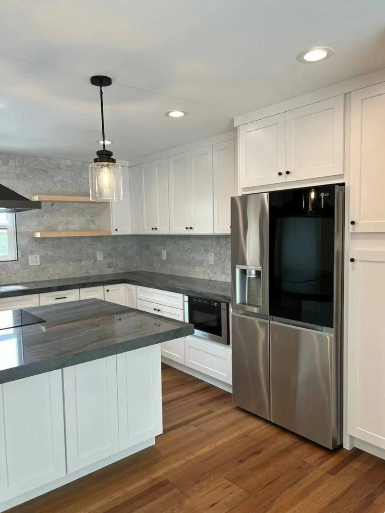
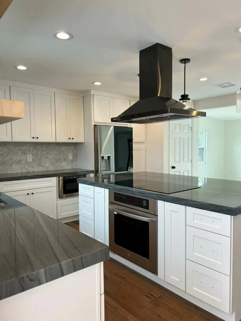
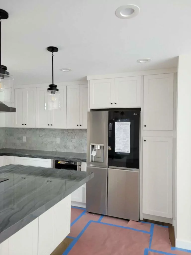
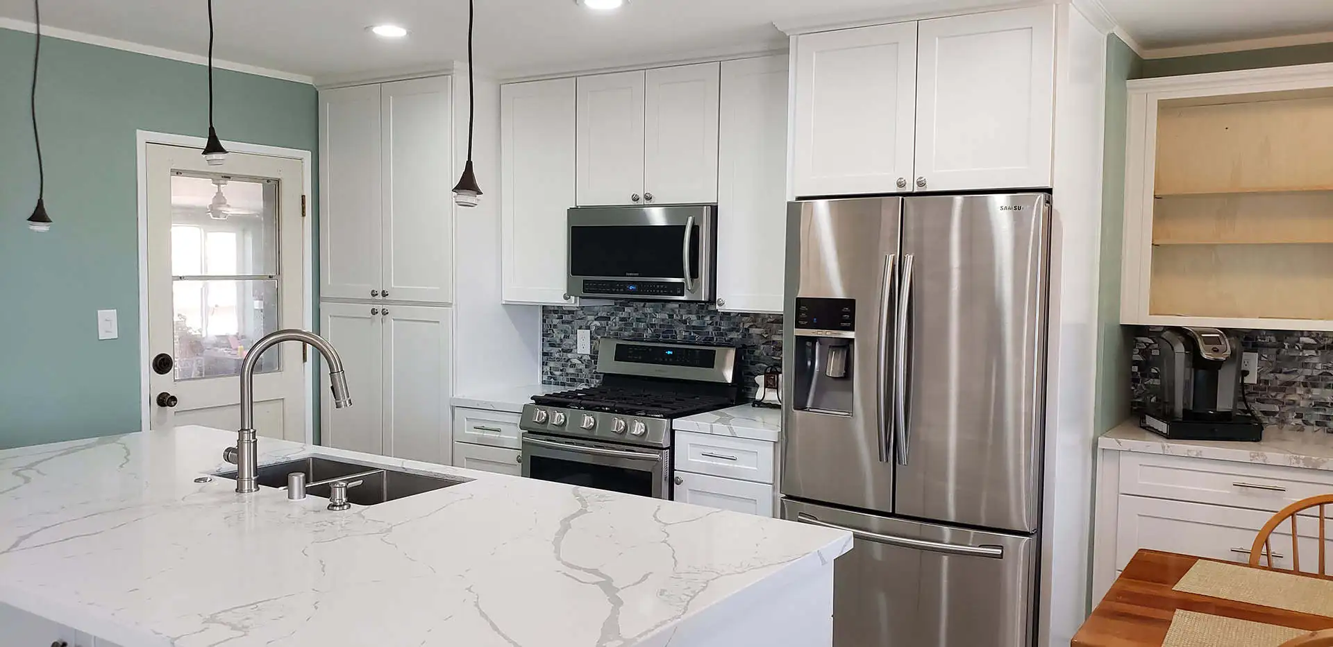
- The first notable change is the replacement of wooden cabinetry with white shaker-style cabinets. Coupled with the relocation of appliances and a new lighting scheme, the kitchen looks bright and spacious.
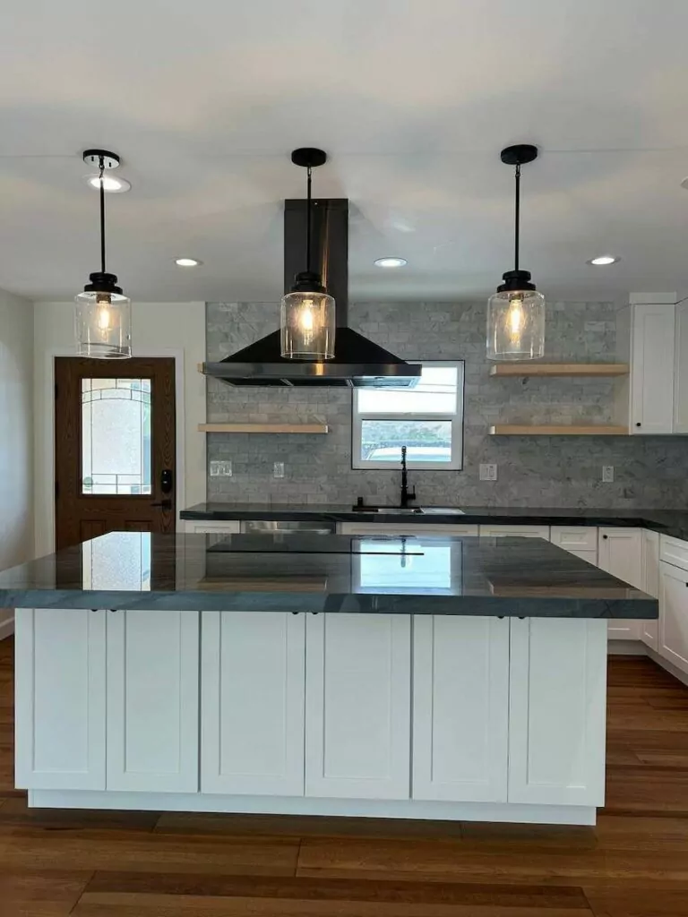
- Floating shelves replaced bulky wall cabinets around the window — the entire space around the sink looks light and airy.
- Silver appliances match perfectly with gray countertops and silvery-gray tiling. The white and silver-gray color scheme gives a polished and chic look.
- Moving the refrigerator to another wall helped us to open up the space; the connected countertops look sleeker offering more space for creating culinary masterpieces.
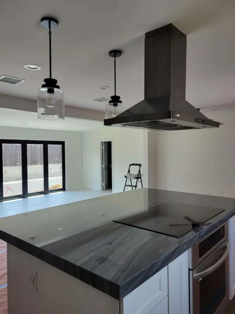
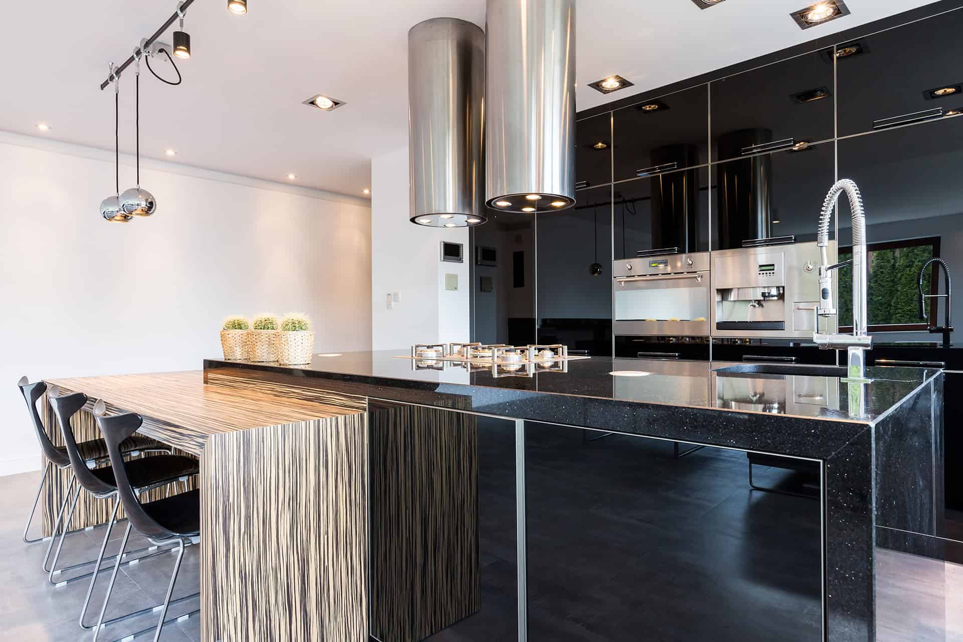
- The kitchen island with the built-in stove and hood over it serves as a working and dining area.
- Black hood, pendant light holders, and kitchen faucet are in contrast with white cabinetry. Gray countertops with lighter shade matching tiling produce a classy yet trendy look.
- We changed the lighting scheme: built-in LED lights ensure that the entire kitchen zone is well-illuminated, while stylish pendant fixtures help to light up the island and act as a stylish décor element.
Result
After the renewal, the kitchen looks trendy, spacious, and welcoming. Built-in LED lights illuminate the entire space, and the stylish trio of pendant lights over the island ensures that the cooking panel is lit well. White L-shaped kitchen with an island is fully functional with plenty of storage space. With the light color palette, the kitchen zone seems roomy: a combination of wall-hanging cabinets with floating shelves allows for keeping surfaces free of clutter and ensures a clean and organized look.

