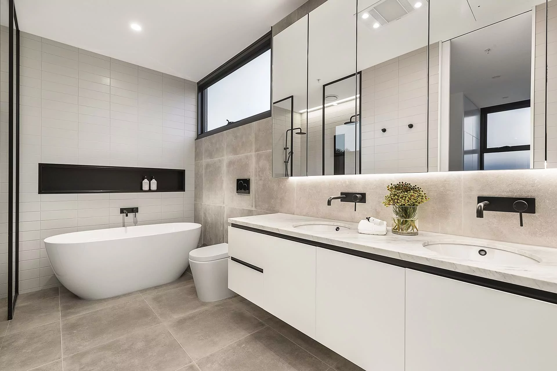
Groysman Construction, a remodel company with a headquarters in San Diego, proudly presents another bathroom remodeling project — our clients intended to renew and visually expand the outdated bathroom, turning it into a modern spa-like zone with a built-in shower unit and a freestanding tub.
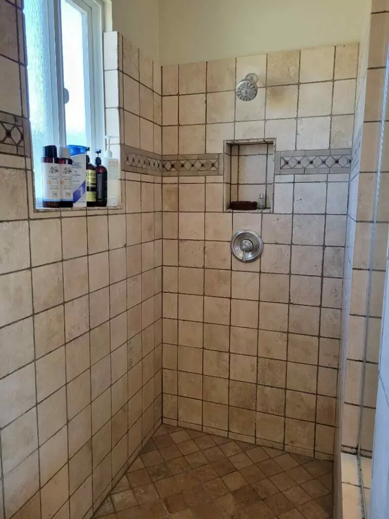
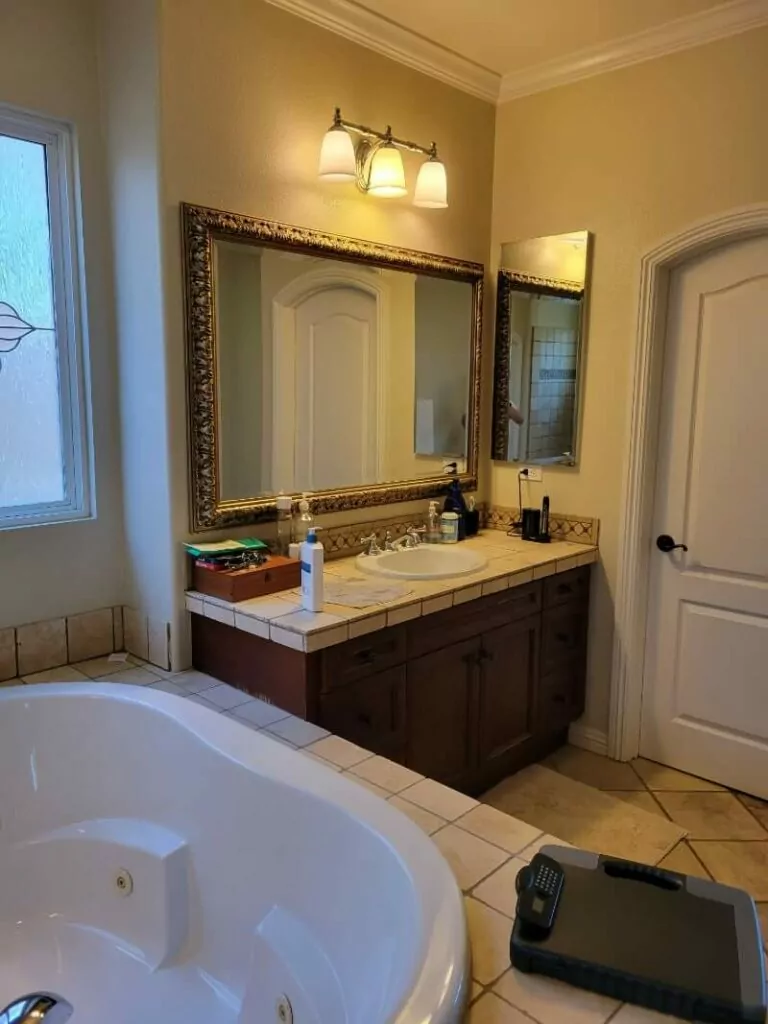
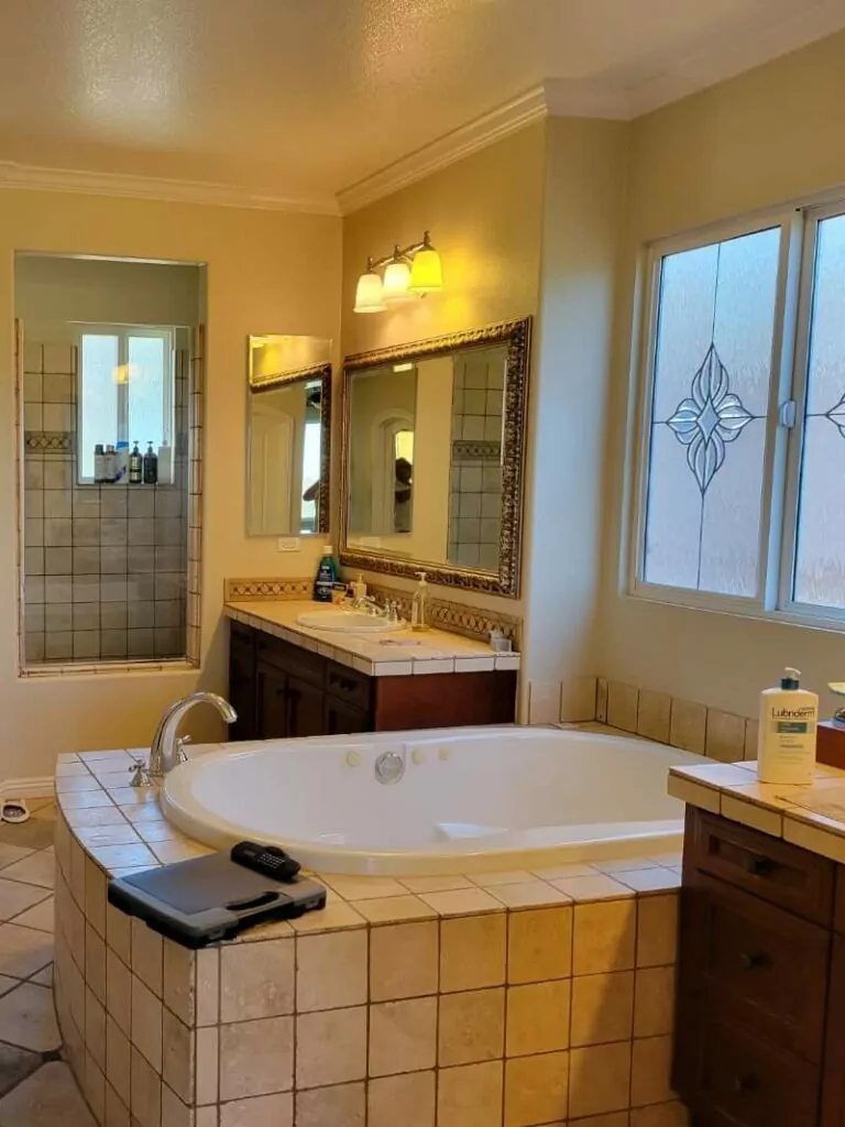
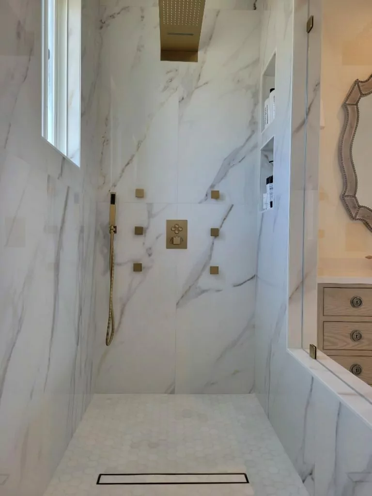
As you can see from the bathroom remodel before and after photos, the entire bathroom area seems more spacious and filled with light.
Bathroom Remodel: Issues & Tasks
The Groysman crew focused on expanding the space visually while keeping the bathroom zone fully functional and comfortable. The built-in Jacuzzi occupied a huge chunk of the space, so we replaced it with a modern freestanding tub. The outdated square tiling was replaced with top-grade ceramic tiles to create seamless flooring and shower unit surfaces. We succeeded in creating a self-care haven for homeowners — the light and spacious bathroom seems welcoming and inviting to relax after daily routine.
Before
Bathroom Remodeling: Changes
We kept the original arrangement of vanity units and the bath; however, the changed tiling creates a totally different feel — stylish and contemporary.
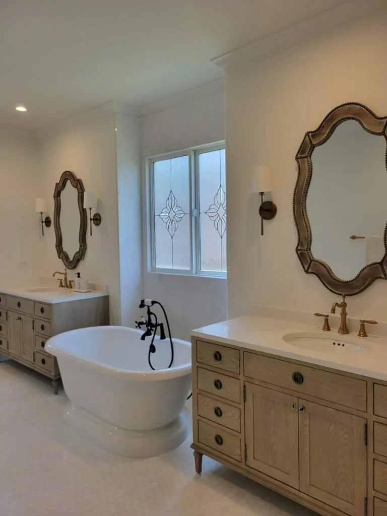
- First of all, we replaced the large built-in Jacuzzi bath that occupied a great part of the bathroom space with a freestanding tub. Installed next to the window, the acrylic white tub with the black mixing faucet is the centerpiece that draws the eye. The new tub takes significantly less space and allows having bathtime bliss comparable to a luxury spa.
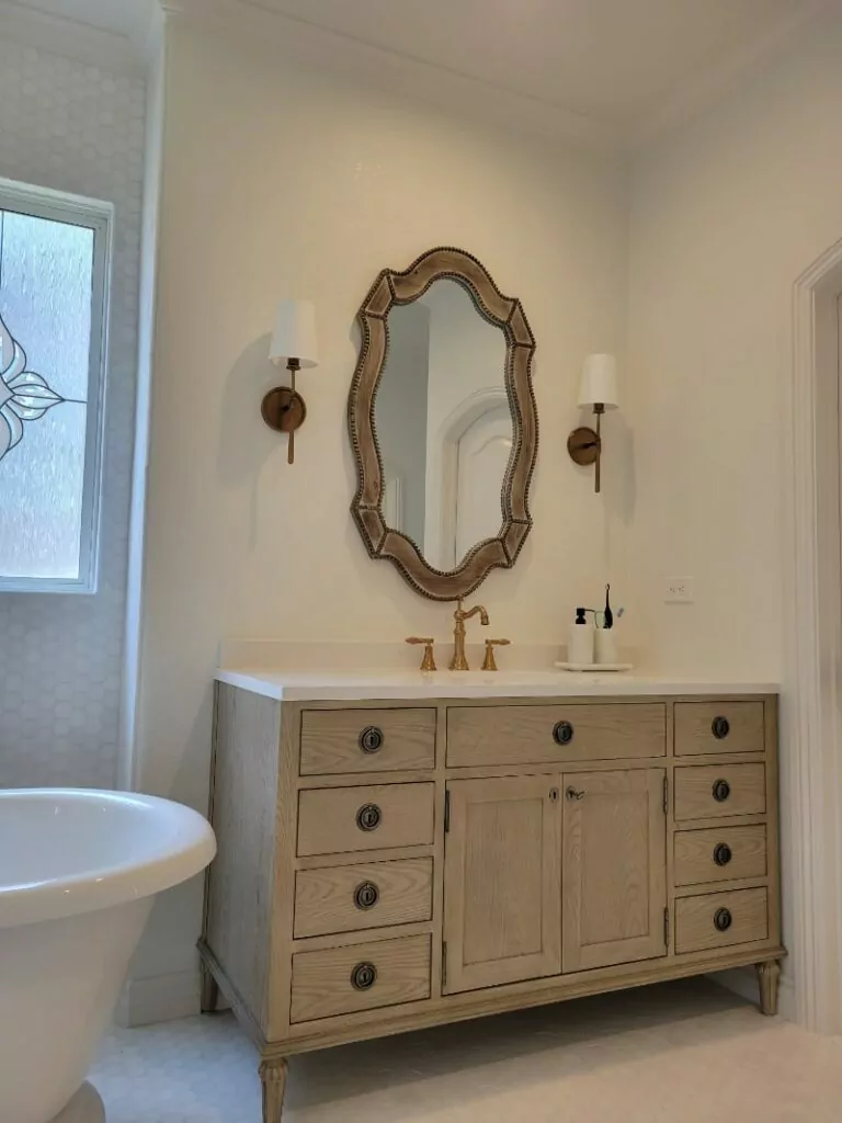
- Wide bulky mirrors over each vanity unit were replaced by narrower brass-framed mirrors. We installed authentic-looking wall luminaries on both sides of the mirrors — they provide enough light for cosmetic procedures and can be used to create softer light for relaxed bathing.
- We changed dark-brown cabinet finishes and protrusive knobs to light brown and used styled sunk hoop-type handles. Lighter tones do not overload the interior and harmonize perfectly with mirrors and fixtures.
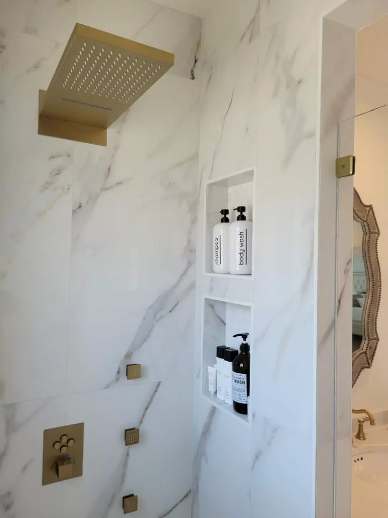
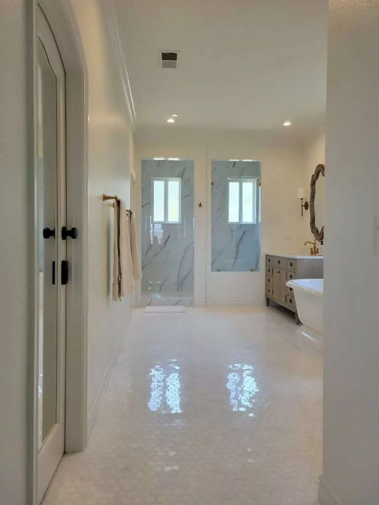
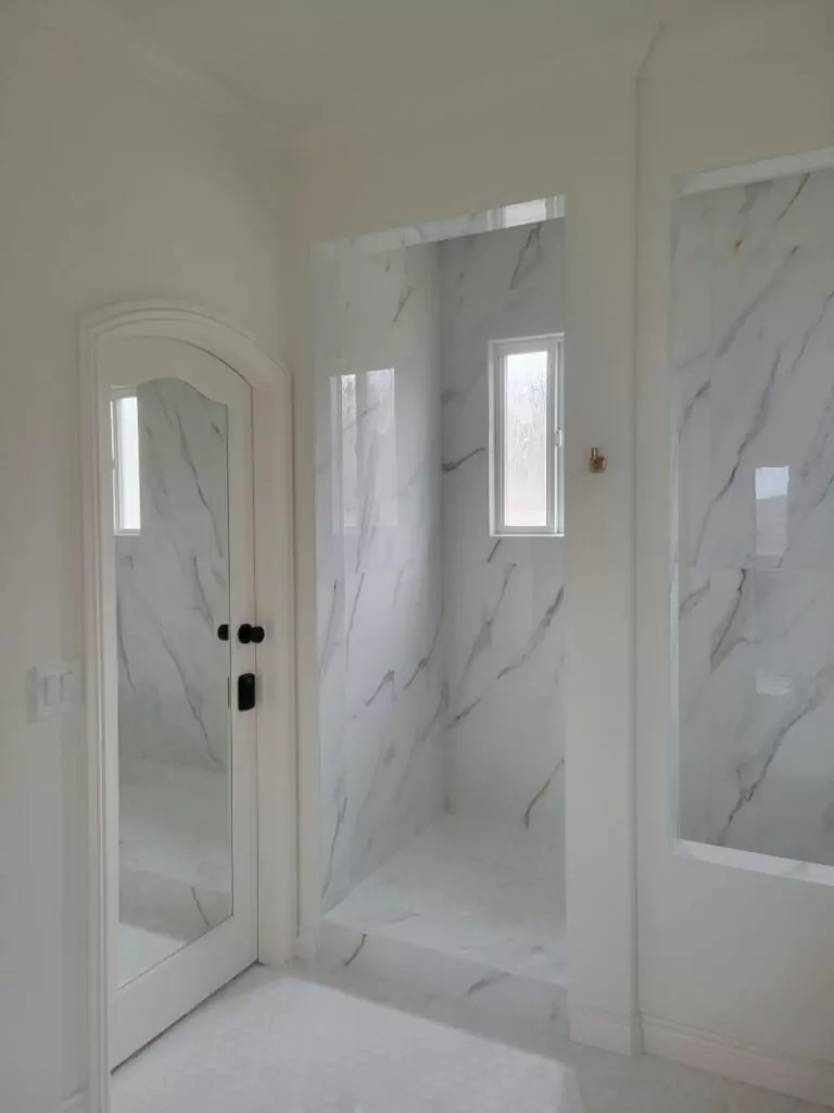
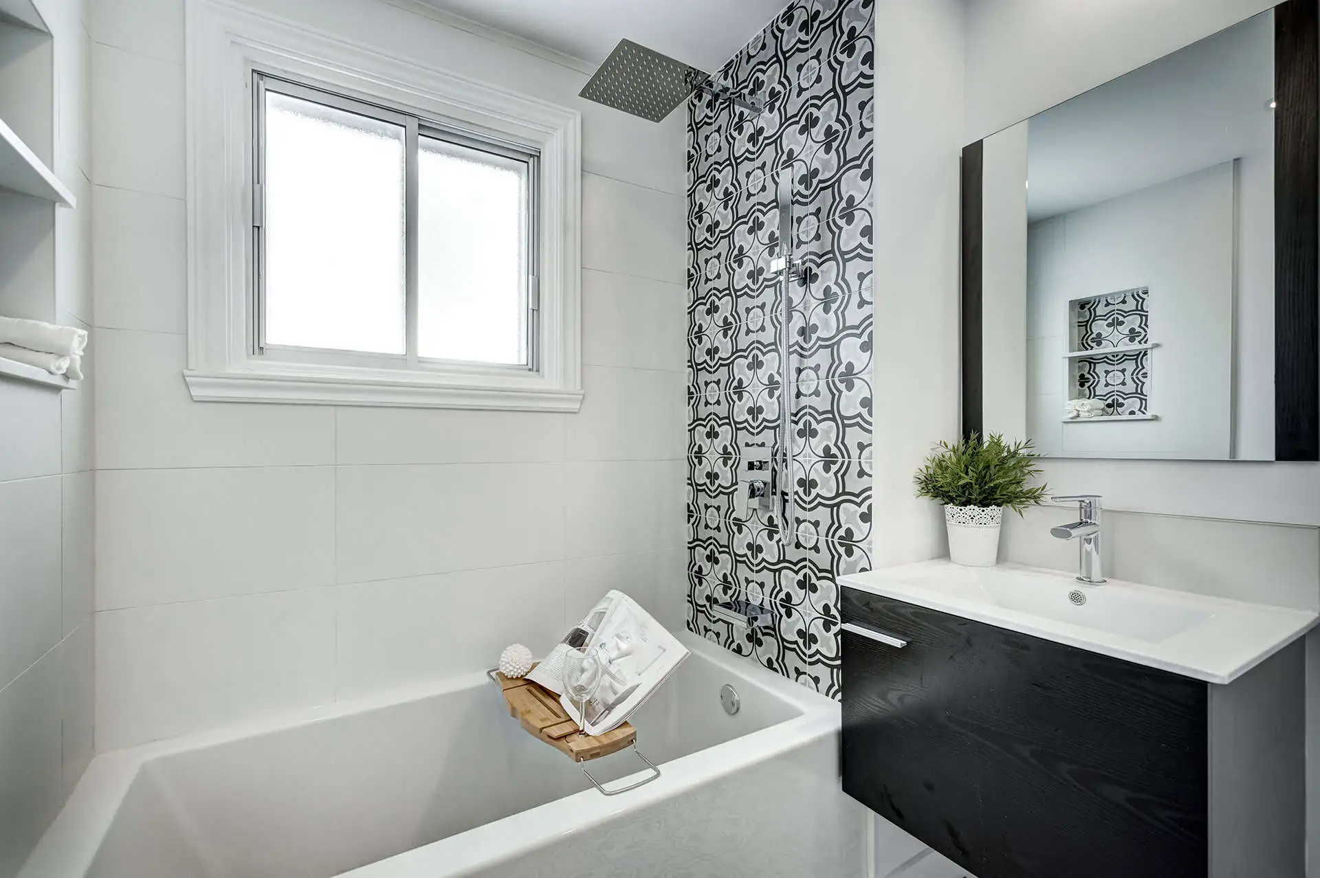
- Old-style tiling in the shape of small squares made the bathroom look cluttered; the Groysman team has changed tiling for larger marble tiles inside the shower unit — the shower area looks absolutely gorgeous with no visible lines connecting tiles; flooring is done in off-white tiles with a trending geometrical textured pattern. A lighter color palette creates an airy feel and the bathroom appears twice larger compared to its older design.
- A walk-in shower in light neutral colors saves and visually expands the precious space. Two built-in wall niches inside a shower unit are arranged one above the other for more comfort during the shower experience. After renovation, shower gel, soap, and loofah can be kept at hand instead of cluttering the window ledge.
- To add vintage chic to the bathroom, we decided to install shower mixers and faucets made of brass. Along with the renewed vanity unit finishes, hardware, and accessories, such as cabinet handles, wall luminaries, and mirror frames, décor elements create a unique inimitable style.
- All in all, despite minimal changes in the equipment arrangement, the space looks much different — trendy, organized, and stylish.
After
Results
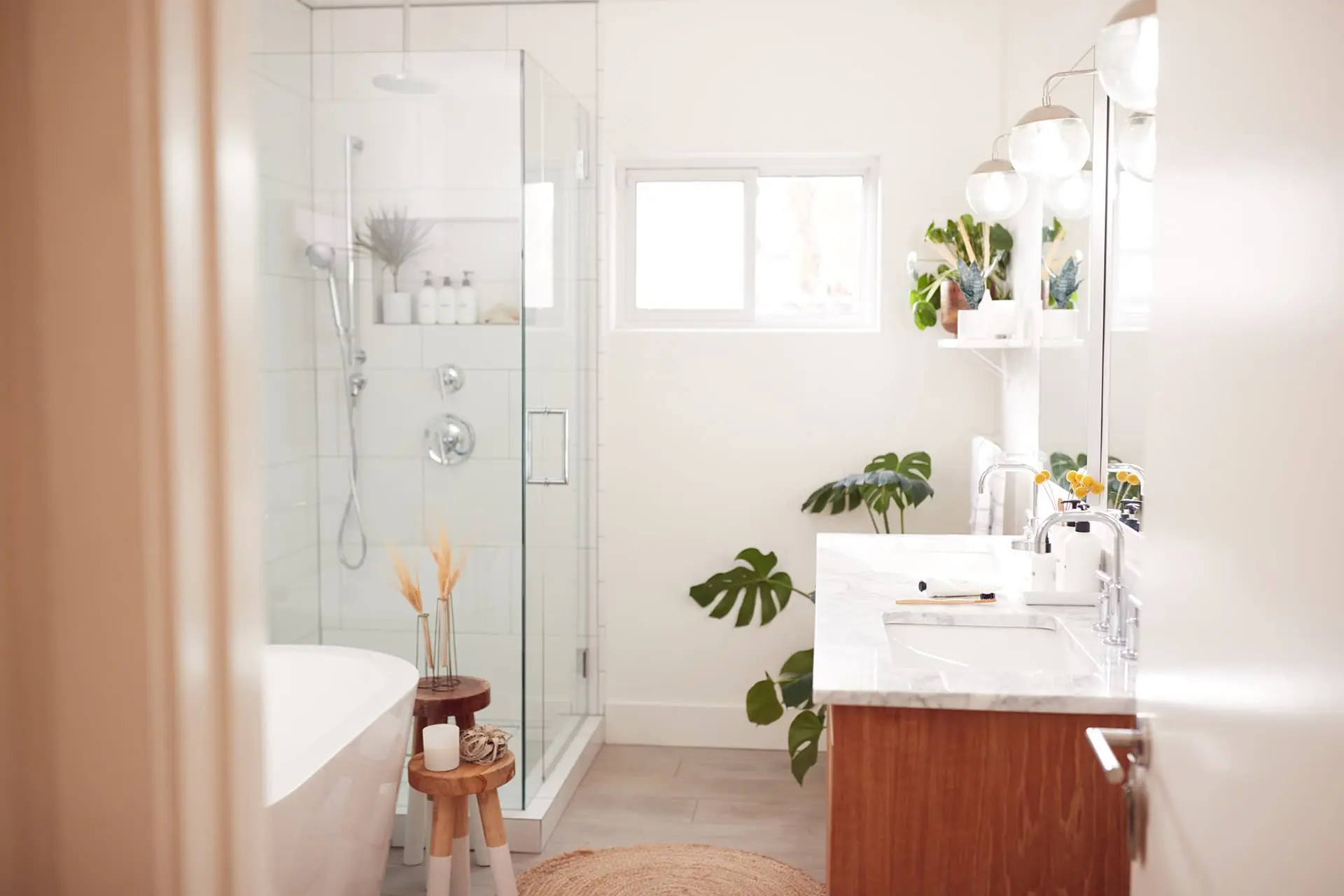
Once all works have been completed, the bathroom became visually larger: a freestanding bathtub occupies less space compared to the built-in Jacuzzi and fits perfectly between two vanity units. The elegant and airy look has been achieved thanks to thorough design planning, the use of a lighter color palette, and stylish décor elements.
We consider this bathroom remodel project both successful and illustrative of how interior design, color scheme, and equipment choice can influence the space, expanding it visually and increasing its functionality.

